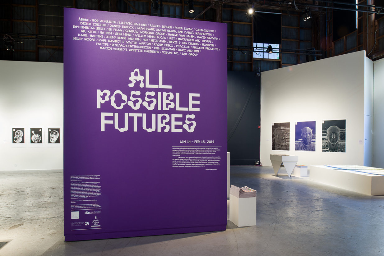
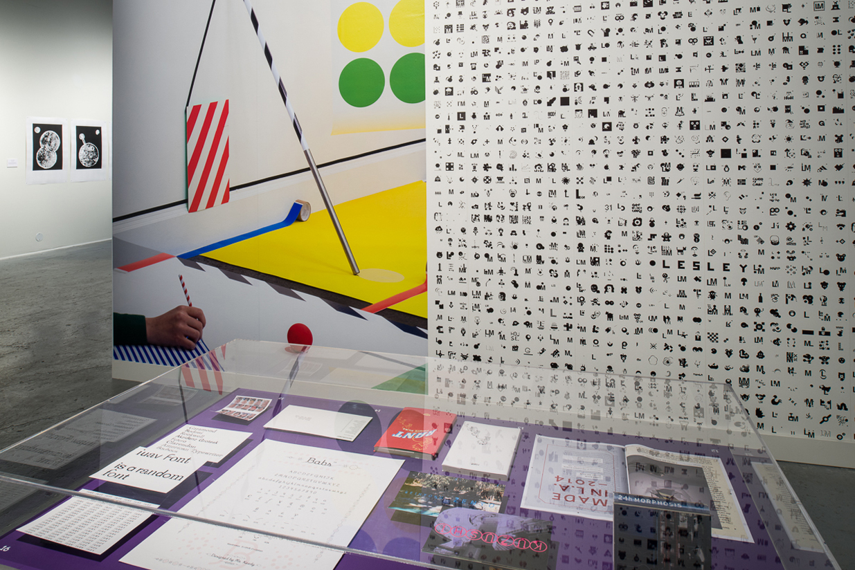
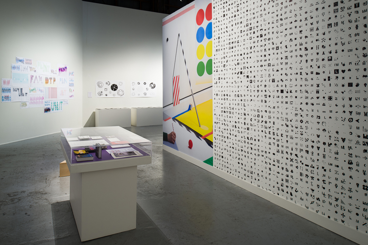
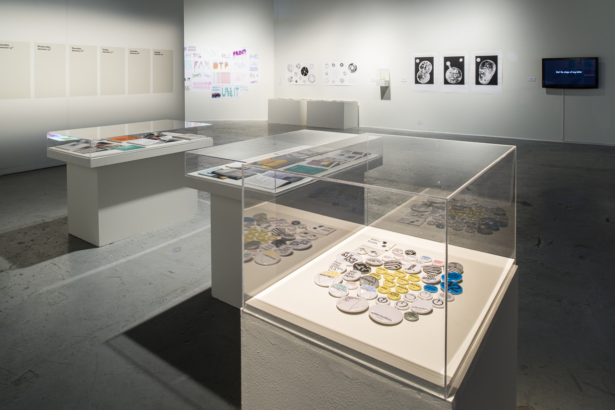
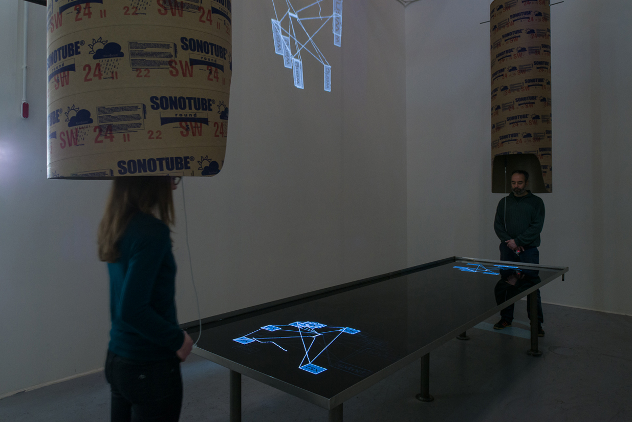
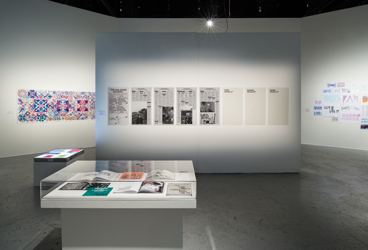
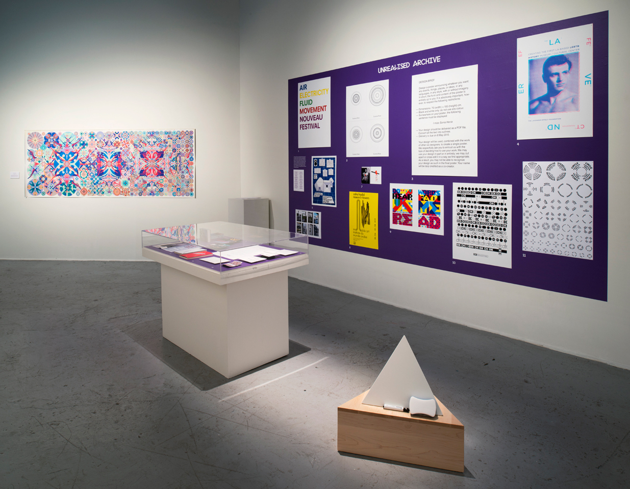
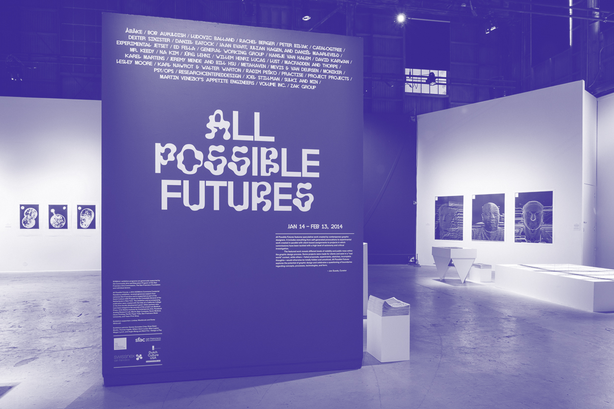
Jon Sueda Surveys 7 Designers
Speculation in a financial context, is an investment involving higher than normal risk in order to obtain a higher than normal reward; risk is seen as an opportunity. Through researching and understanding the financial market, a speculator can foresee potential increase in the value of a product. This person can then buy stocks in that commodity while the price is low. If the projection holds true, there will be a great profit … but if it is wrong, they can lose everything.
Speculative Fiction is an all-encompassing classification covering fiction genres that describe a reality different from the world we live in today. It includes fantasy, horror, supernatural, superhero, utopian, dystopian, apocalyptic, post-apocalyptic and science fiction writing, among others. Besides alternate versions of our own reality, speculative fiction can explore worlds we have never heard of, with beings that have never existed. The premise most speculative fiction writers base their stories on is the simple question “what if?”
Spec Work is short for “speculative work” in the fields of design and advertising. The term describes any project created on a speculative basis for a client without a fair predetermined fee. This kind of work has negative connotations to “professionals” and is highly frowned upon. Based on most design organization guidelines, spec work devalues the profession because: it often upsets the value of design by working for wages far below industry standards; the competitive nature of spec work (many firms competing for the same commission) fosters no client/designer interaction, often yielding unsuccessful results; compressed schedules don’t allow adequate research to be done, resulting in empty “aesthetic” solutions.
Although speculative practices have existed throughout the history of design, most notably in architecture, only a small group of graphic designers have positioned themselves in contexts where they are able to pursue explorations built on risk and uncertain ground. This could be the result of numerous unsympathetic conditions deeply rooted in traditional design practice, including the commission structure in which most work is based. According to this model, a client comes to the designer with a brief from which he or she responds by offering viable options for solving the problem. For most clients who want a sellable product, “what if?” is not the most comfortable starting point. For this reason, speculative projects tend to exist as self-initiated efforts by designers acting as their own clients, proposals within academic contexts, or simply unrealized provocations.
This series of interviews focuses on a small group of graphic designers who have built practices that include a space for questioning the current boundaries of design concepts, processes, technologies, and form. A conversation with Anthony Dunne and Fiona Raby, supplements this dialogue, offering a peek into their “Critical Design” practice of creating designed artifacts that “stimulate discussion and debate amongst designers, industry and the public about the social, cultural and ethical implications of existing and emerging technologies.”
The Projects
A Dunne & Raby: Technological Dreams Series, No.1: Robots (2007)
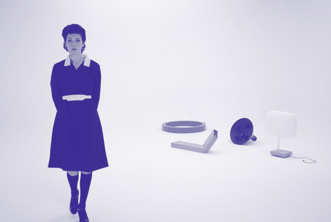
Robot 1, Robot 3, Robot 2, Robot 4
Jon Sueda: Do you consider your work to be speculative?
Dunne & Raby: Yes, definitely, especially in the theoretical or hypothetical sense. Even when we prototype something and it technically works, we see it as a speculation on what could be rather than something that might fit into today’s world.
JS: What is the Technological Dreams Series (specifically “the Robot Project”), and what was its impetus?
D&R: Technological Dreams Series, No. 1: Robots came about when we were asked to develop a new project for an exhibition called Designing Critical Design at Z33 last year. At the time, we were in Tokyo, surrounded by technology, and somehow we got around to thinking that one object designers rarely deal with is the robot. There are art robots and of course many technical ones, but few, if any, that explore their aesthetic, social, and cultural meanings, especially in the home. We had a small budget and a short amount of time, so we decided to focus on making props for a video. Each robot hints at a different relationship to its owner, from mutual coexistence to neediness. They’re meant to hint rather than explicitly communicate, and we worked with Noam Toran to produce a video that evokes this and would work in an exhibition rather than a piece of straight-forward explanation. The woman in the video is scaled at life-size to look like she is there very close by. When she interacts with the robots, they are brought to life.
Robot 1 This one is very independent. It lives in its own world getting on with its work. We don’t really need to know what it does as long as it does it well. It could be running the computers that manage our home. It has one quirk; it needs to avoid strong electromagnetic fields, as these might cause it to malfunction. Every time a TV or radio is switched on or a mobile phone is activated, it moves itself to the electromagnetically quietest part of the room. As it is ring-shaped, the owners could, if they liked, place their chair in its center, or stand there and enjoy the fact that this is a good space to be in.
Robot 2 In the future, products/robots might not be designed for specific tasks or jobs. Instead, they might be given jobs based on behaviors and qualities that emerge over time. This robot is very nervous — so nervous, in fact, that as soon as someone enters a room, it turns to face them and analyses them with its many eyes. It takes in as much information as it possibly can; it anaylses at micro-scales and looks for infinitely tiny changes. With so much data and accuracy, no wonder it’s jittery. Which piece of data is more significant than another? Which complex combination will warn us about the potential dangers ahead? If the person approaches too closely it becomes extremely agitated and even hysterical. Home security might be a good use of this robot’s neurosis.
Robot 3 This one is very needy. It’s fidgety and whiny. Although extremely smart, it is trapped in an underdeveloped body and depends on its owner to move it about. We become an intrinsic part of its daily existence, or so we are led to believe. Originally, manufacturers would have made robots speak human languages, but over time they will evolve their own language. You can still hear human traces in its voice.
Robot 4 More and more of our data, even our most personal and secret information, will be stored on digital databases. How do we ensure that only we can access it? This robot is a sentinel; it uses retinal scanning technology to decide who accesses our data. In films, iris-scanning is always based on a quick glance. This robot demands that you stare into its eyes for a long time. It needs to be absolutely sure it really is you.
JS: Do you often use the strategy of creating a “fiction” within your design process? If so, can you explain this process?
D&R: “Fiction” is a very important concept for us. We are careful to stay away from “fantasy,” though. We do not design for today. Our designs are always intended for another time or place and therefore exist as fictions. They are meant as alternatives, but that does not mean they do not technically function. It simply means that the values are at odds with those of today. We think of them as social fictions or even value fictions, sort of related to science fiction but with a shift of emphasis away from technology to the human side. They are intended to remind us that what we see around us, “reality,” is not fixed and that there are other possibilities.
JS: You said this in an interview about this project: “The purpose of these design proposals is to ask questions. And to trigger creative thinking in others. To jolt people off course a little. The solutions have not all been decided yet!” Did this project stimulate discussion or debate in your studio? What discussion was triggered through this line of questioning?
D&R: Well, we were approached by a consortium of European robotics engineers and invited to join a proposal for a very large European-funded research project exploring robotics. We were also approached by Microsoft research labs in the UK to make a proposal to get funding for a PhD student to explore these ideas further in the department I head at the Royal College of Art, which begins in October. The project was also shown in Design and the Elastic Mind at Museum of Modern Art, New York and is now in its permanent collection, as well as the permanent collection of FNAC in France. It continues to be exhibited internationally as well. So, I’m not sure if it has created a lot of debate as such, but it is certainly get- ting people to think about robots in a different way.
JS: What do you do with rejected proposals?
D&R: Rejected by who? In a way, all our proposals are rejected; that’s what we aim for. They should not fit into how things are now, but instead, point toward other possibilities. Of course on a practical level, proposals need to be made for funding, but beyond that, when we propose that they are implemented, they are usually rejected based on there not being a mar- ket for our ideas — exactly the point.
JS: How do you define the realization of a design idea or concept?
D&R: We try to take an idea to prototype stage — failing that, then at least a video scenario or simulation. This is because we are designing and proposing new functions that need to be experi- enced or presented in a way that viewers can imagine using and living with them. This interaction between the viewers’ imagination and our designs is the final product. It’s like window-shopping; when people are looking at products in a shop, they are imagining them in their lives and how they will fit in. People don’t do this when they look at art. We want people to imagine our products in their lives and think about what would have to change in order for them to make sense or fit in.
Architectural Association Print Studio / Zak Kyes & Wayne Daly (Interview with Zak Kyes): Bedford Press (2008)
Bedford Press Logo
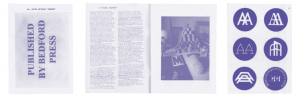
Published by Bedford Press
Jon Sueda: Do you consider your work to be speculative?
Zak Kyes: I’m writing my much delayed responses to your questions from the library at the Architectural Association. This setting, furnished by volumes of unrealized projects, is an appropriate reminder that speculative practices in design have always been one aspect, albeit a marginal one, of a critical design practice. With a certain prescience, the immaterial and speculative nature of many architectural proposals from this period found their most logical expression not in built but book form. At this moment, there is there is a reconnection to this experimental legacy which uses design as a critical tool. These publications and their dissemination continue to be sites for debate and exchange. So, in short, yes.
JS: What is Bedford Press and how does it function within the Architectural Association’s Print Studio?
ZK: I joined the Architectural Association as Art Director of the AA Print Studio in September 2006. Since then we have begun to refocus our activities as an autonomous unit within the broader cultural programme of the school. The Print Studio was originally established in 1971/72 by Denis Crompton of Archigram to shape the school’s architectural discourse through the production and distribution of publications. Books have been a key reason for the school’s success during times when many projects were never intended to be realized. Consequently, the book became an ideal architectural site.
An essential element of this renewed focus is Bedford Press, a small-scale, fully functioning printing press and publisher operating out of a closet at the Architectural Association’s Bedford Square home in central London. The aim of the press is to integrate the publication of printed materials into the AA Print Studio’s existing focus on generating content, editing and design. By establish- ing a direct link between content/design and technology/production we hope to create a more responsive model of small-scale architectural publishing that is nimble enough to encompass the entire chain of production in one fluid activity, from the initial commission through to the final printing.
The term “private press” refers to a movement in book production that flourished at the end of the nineteenth century under the influence of people like William Morris and his own pioneering Kelmscott Press (1891). The products created by these presses were intelligently made publications that emphasized the book as a “new work” and also a “work of art,” rather than simply a vehicle for documentation. Empowered by this Arts and Crafts innovation, architectural discourse has increasingly been articulated through an ever-expanding array of publications. With the introduction of an autonomous press at the AA, we aim to experiment with not only the material form of the books we publish but also their content.
JS: How did you initially define this proposal? Do you foresee the addition of this press (the actual print production aspect of design) changing the way you work?
ZK: An inquiry always conceals another inquiry. The value of a proposal, or an “inquiry,” is precisely the degree to which it leads to unexpected outcomes. In Forms of Inquiry, an exhibition that presented a movement of critical practices in graphic design, we adopted the term “inquiry” to describe this work. This choice was intended to distinguish the act of “inquiry” from the ubiquitous incentive to “research,” which has long carried with it a variety of assumptions and interpretative baggage. The distinction is important; for unlike empirical research, with its appropriation of the paradigm of scientific data-gathering and problem-solving, the term “inquiry” suggests an almost antimethodological methodology — posing questions and pursuing paths without necessarily knowing where they will lead.
JS: How do you envision the “Publish-on-Demand” model functioning in an academic institution?
ZK: At the Architectural Association it is already a built-in function, which is both economic and also carries out a certain ideology. One of the first projects carried out by Bedford Press is the Excursus lecture and publication series. Excusus #1: Exhibition Prosthetics expands upon Joseph Grigely’s recent lecture and exchange with curator Hans Ulrich Obrist and myself at the AA. With the Excursus series we aimed to invite practitioners from within and beyond the culture of architecture whose practice engages and rethinks the form and activity of publishing today. The publications take the shape of inexpensive booklets printed in small editions on Bedford Press.
JS: With the world’s economic crisis on everyone’s mind, most institutions seem to be cutting back on printed material… Do you foresee this model offering new possibilities for publishing?
ZK: Its impossible to know what the effects will be, other than that the implications are on a global scale and will affect nearly every aspect of cultural production. The most spectacular examples of corporate sponsorship such as Deutsche Bank’s Frieze Art Fair, UBS’s Art Basel, Unilever’s Tate Turbine Hall Series seem to already have run their course; if it wasn’t for the financial crisis, the art world would have been likely to experience its own crisis in the near future. A parallel that Joseph Grigely suggested might be the savings and loan crisis of the 1980s, which came at a time when the art world was also experiencing a bubble. This simultaneous crash in the markets and the art world coincided with some of the most gratuitous artistic productions. Art came back in the 90s without the megalomania of the 80s with a new energy and a new ephemerality. It was healthy and energizing for the art world, and a whole new cast of personalities and projects emerged that might be described as “kindergarten aesthetics.” These artists used much more modest materials, resources and budgets. I can imagine something similar happening, bringing with it new possibilities. If you’re like me, you don’t have far to fall… we are always somehow in crisis. To come back to your question financial cutbacks on publications can only be a good thing when considering the mainstream publishing industry. It will necesitate new economies of production, such as print-on-demand as you suggest; Bedford Press is our own modest response to this situation. This might be the emergence of a new sobriety which under the surface is actually much more experimental and economic than its predecessors.
JS: How do you define the realization of a design idea or concept?
ZK: Every idea finds its most perfect form in a different medium. The neo-avant-garde made clear that ideas can sometimes best exist as exactly that, ideas. I prefer to see individual projects as seeds and doors that relate to a wider practice and might lead to unrealized potentials. The possibilities of a real idea (as opposed to a realized idea) might be just be a more potent provocation in considering the fate of design cultures.
LUST: Sound of the Internet (2005)
Sound of the Internet
Jon Sueda: Do you consider your work to be speculative?
LUST: In Holland, there is a small group of designers that work in the field of “design research,” — that is, design for the sake of research. Although many aspects of our work involve this process, the projects are always trying to answer some sort of brief. That is, they must function in the real world instead of just ending up in an exhibition, publication, or article about that specific project. Therefore, our projects are not speculative in an academic sense. However, our work is by definition speculative in the sense that we are always trying to push the boundaries of the design process. That way, we can never guess what our outcome will be or if it will work within the context of its conception. An example of this is the “landing strip” we designed for the Todaysart festival last year. This is a position we have claimed for ourselves, and our clients know this when they hire us. Our briefs are never fully defined, so there is much room for interpretation and experimentation.
JS: What is the Sound of the internet, and what was the impetus for this project? Was it client-based, or a completely self-initiated proposition?
L: The AIGA approached us and asked if we wanted to contribute a piece for Loop, a new online magazine they started that would cover the field of new media. The idea was that each issue would feature a theme on which designers and design writers could expound. The theme for issue #1 was “sound.” That was the basis of our brief. Simply, do something in new media regarding sound.
The project allows you to hear the “sound of the Internet” between your computer and our website. The Internet has no central location; the connection from here to there is through others (this is well illustrated here: www.visualroute.net. The documentation of your journey or route is the list of IP addresses between you and your destination.
The result of the project is the most honest audio document of your route because nothing is derived from pre-existing sounds. All that is added is a simple framework for the audio file to be created (i.e., binary numbers that tell your computer that this is a wav file — the content of this wav file is binary numbers of the IP addresses). Using a similar process, your route is also translated into visual form using color and shape.
JS: Did you make any new discoveries in your research or during the making of the piece?
L: Yes, we asked ourselves what sound is on the Internet? Is it a “sum” of all the sound files that are being hosted, downloaded, and streamed? That seemed too obvious and shortsighted to us initially. We propositioned that the Internet itself must have its own inherent “sound,” just like outer space also has its own sound as recorded by the Voyager space craft. So the research was all based on trying to figure out what that sound would be. This led us to many tests, which were quite interesting. However, the most provocative tests were not realizable within the constraints of the project. It was just as important to make those discoveries for future projects.
JS: Did this project stimulate discussion or debate in your studio or with others once you presented it?
L: Yes, most projects require heavy discussion, especially since many of those (such as the Loop project) don’t have clear-cut outcomes. When this is the case, the discussions seem to revolve not around the technical or formal specificities of a piece, but rather its conceptual foundation. We constantly ask ourselves if our thinking is good and solid. For the Loop piece, for example, we were not concerned too much about the quality of the sound that was produced, but rather that we were using the “correct” source of the sound within the context of our concept. This makes for a qualitatively better and richer discussion than “Oh, the pitch should be higher, or the colors should be livelier, etc.” The most debated question was, “If your monitor was a window to Internet, what would you hear if you opened it?”
JS: If this project is about sound, why did you feel it was necessary to create a visual to acompany your interpreation of sound? Did visualizing this form strengthen the piece for you?
L: The specific question one of us brought up was, “What if your computer monitor was a window to the Internet? What would you hear if you were able to open it?” So this idea lent itself to the visual of the “imaginary window,” and the accompanying abstraction we designed as a representa- tion of that concept.
JS: If this project is about sound, why did you feel it was necessary to create a visual to acompany your interpreation of sound? Did visualizing this form strengthen the piece for you?
L: The specific question one of us brought up was, “What if your computer monitor was a window to the Internet? What would you hear if you were able to open it?” So this idea lent itself to the visual of the “imaginary window,” and the accompanying abstraction we designed as a representation of that concept.
JS: In the text that introduces the project, you said that “more interesting ‘Internet’ work will not just ‘exist’ on the Internet, but rely on the Internet for its existence.” Since creating this project, have you reflected on or reacted to this idea with any other speculative concepts or projects?
L: Yes, and we still firmly believe this! The Internet is more than just a “carrier” for interactive or time-based work. It is a “medium,” a “context” where works are presented and therefore influenced by. This meta-level is the most interesting aspect of working on Internet-based pieces. It also represents the area where new thinking is most needed. Artists and designers that approach it as a glorified television or cinema screen are missing the point.
Some lust pieces that use this idea:
JS: What do you do with rejected proposals?
L: Put them in our archive boxes. 
We seldom ever reuse a rejected proposal, since the parameters of each project are different and therefore lead to a different result. However, sometimes the conceptual base for these projects is still valid and valuable, and we do consider rethinking these or expounding upon them for new projects.
Design is, after all, an iterative process, and unlike in politics, “flip-flopping” is a valid way of reconsidering outdated values and traditions in design.
JS: How do you define the realization of a design idea or concept?
L: This is actually the key question, isn’t it? In a work methodology such as ours, when is enough research enough? The answer is both simple and complex. The simple answer is: you are limited by external factors such as budget, time, materials, technology, etc… So at a certain point, when the project is approaching its end, decisions have to be made from all the research and a product must be realized.
Related to that however, the more complex answer is: To us, the research is often the conceptual result — let’s say, the “meta-language” of the project. By doing as much research as possible, we have built up a “vocabulary” of the project that enables us to speak the “language” of the project. The more extensive that vocabulary is, the more complex the “sentences” we can make. Then all that is left to do is choose a fitting end result and use the vocabulary appropriate for that. At this point, regardless of format or scale, it doesn’t really matter what the physical iteration is — whether a postcard, a postage stamp, a website, a font, a spatial installation, a book, an article, or even just an archival documentation of the research — as long as the final result “speaks” this meta-language, the concept has been realized.
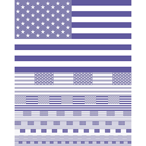
MR. Keedy: OK Identity (1999)
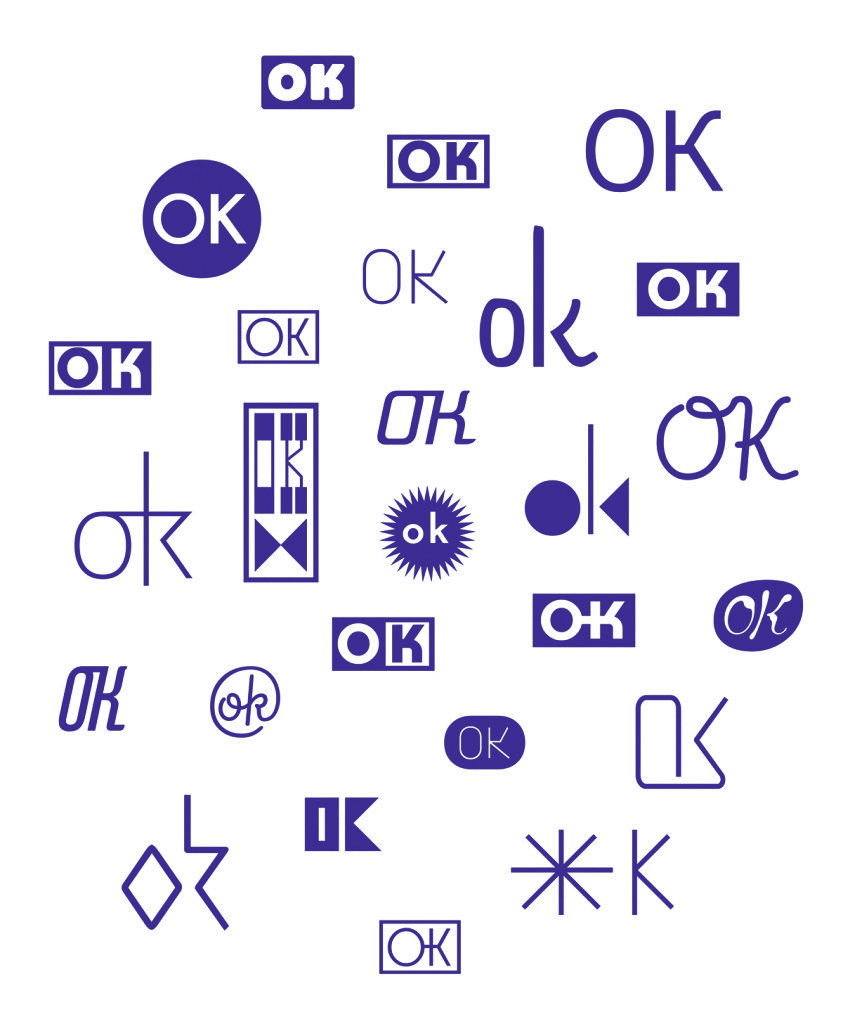
OK Identity
Jon Sueda: Do you consider your work to be speculative?
Mr. Keedy: Yes. I speculate that someone besides me will find it interesting and useful.
JS: What is the OK store, and what was the impetus for this project?
MK: OK is a retail shop specializing in modern furnishings. The identity system is a collection of logos and text that are designed to work together as interchangeable elements instead of a fixed graphic image. All of the elements are contained in a “font” that the owner can use to design in any application as needed. I designed a “kit of parts” that fit together in unlimited combinations.
JS: With the OK typeface, the user can compose multiple variations of these components. Was this function based on the project brief (did the client wanted a mutable identity) or was that an idea you were thinking about?
MK: It was my idea. He really only wanted or needed a simple logo. I over-delivered. It was something I had been thinking about at that time. I had been talking to Neville Brody about the idea that designers would be designing systems and templates as opposed to single objects.
JS: Since this identity is a typeface, did you intend it to be implemented by a graphic designer, or were you thinking it could be used by a non-designer just as effectively?
MK: The idea was that it would be used by non-designers — the owner and his employees — to use for whatever need may arise.
JS: Why was the identity never used to its full capacity?
MK: Surprisingly, not everyone wants to be a graphic designer. In fact, a lot of people don’t want to figure out how things should look. They are happy to leave it to a designer so they can be doing something else.
JS: Did this project stimulate discussion or debate in your studio? What was the context for an identity like this at that time?
MK: I think it was too much too soon. Now people are a lot more used to laying out pages and customizing graphics and are increasingly comfortable doing it. Faced with too many options, people often make the simplest choices. Even designers themselves will often do as little designing as possible (for which they have many rationalizations), because exercising creative ingenuity can be a daunting task.
JS: When did you actually propose this idea to the client?
MK: I don’t remember exactly, the original file says September 1999.
JS: Have you used a similar concept or technology on other projects?
MK: Yes. The identity I just did for R Wines and R BAR consists of different versions of a logo and related graphic ornaments and patterns. The difference this time is that the “kit of parts” is put together by designers.
JS: What do you do with rejected proposals?
MK: I try to forget about them. I usually can’t “recycle” them because they are delimited to the original context. It’s not like it was when I worked at some unnamed design offices in the 80’s and we would take all the rejected logos and put them back into the logo drawer for the next client. I could put them together in a book called If Only, but for me design has to live primarily in the “real world” or it is just an exercise or self-promotion. Not that there is anything wrong with that, it’s just that it is mostly of interest to a few other designers, and I prefer to make my design work for everybody if I can.
Daniel Eatock: An Idea For… (2005)
An Idea for…
Jon Sueda: Do you consider your work to be speculative?
JS: What is the An Idea For… project, and what was its impetus?
DE: They are ideas I wanted to share in a general way, that point to a specific context for which they may be realized.
JS: The final form of some of your work, such as An Idea For… are text based descriptions of
ideas or lists, not a material objects. As a graphic designer, how do you define this area of your work?
DE: I have a background in graphic design and use graphic design, but I don’t practice graphic design. I don’t define the work as graphic design. I presented/published it on my website; it is this context that defines the work.
JS: Why are these ideas best left as descriptions and not executed?
DE: Some would be nice to see made or executed. (sounds so violent)!
JS: Have you secretly visualized any of these ideas? If so, was it a letdown, or better then you ever imagined? If not, would you be open to someone else visualizing your idea?
DE: I avoid secrets; I like sharing and being open. Realizing and visualizing are different. I would prefer them to be realized, not visualized.
I am happy to work with people to realize these ideas; I like participatory works. I would not like somebody to take the idea and make it as if it were their own, but if they used it as an instruction or like a musical score, etc., then that would be very interesting.
JS: Do you often use a non-visual/text-based strategy as part of your process with commissioned or client-based projects?
DE: Always — talking is about 99 percent of what I do.
JS: How do you define the realization of a design idea or concept?
DE: When it’s spoken, written, drawn, made, built, constructed, photographed, published, shared.
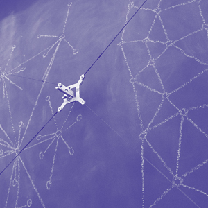
Sean Donahue / researchcentereddesign: Dimensional Design Research: The Roller Ball (2004)
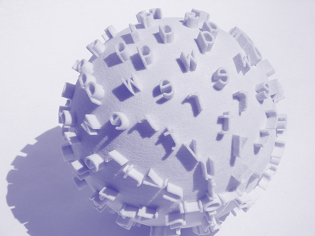
The Roller Ball
Jon Sueda: Do you consider your work to be speculative?
Sean Donahue: I think a large component of my work is speculative. Speculative inquiry helps to provide a framework from which to see convention, form, subjects, and my own assumptions through a different lens. It provides me an opportunity to pose questions that ultimately translate into more significant inquires about the world around me and my discipline — specifically where, how, and to what it contributes.
JS: What is the Roller Ball, and what was the impetus for this project?
SD: The Roller Ball is a dimensional poster, which in this case includes a series of phrases and alphabets. Depending on how you role the ball, or “poster,” it creates different compositions and sequences using the phrases and alphabets extruded on its surface, leaving the layout or composition of the imprinted message open to the viewer’s or “printer’s” interests and decisions. Since it is rolled and not pressed, the letters and phrases on the ball reveal themselves in different sequences and in different compositions. Each person that engages the ball will inherently role it differently and thereby reveal or create a different composition and message, making it a significantly more organic piece then its traditional ink-base counterpart.
JS: You call this a poster. Was this form derived as a response to or a reflection of a particular content that was meant to be a poster?
SD: No, it was more a response to a series of questions I had regarding the discipline’s expectations surrounding what a poster needed to be. I wanted to know what questions a three-dimensional poster posed that a two-dimensional poster did not. What a curved surface enabled that a flat one did not. Or could communication be imparted by allowing someone to “print,” not just look at the printed object? And lastly, as a designer, could my offerings include not just the ability to construct the printed page but the ability to design a vehicle or space that enabled others to participate in the act of printing and the creation of serials, and what outcomes did that result in?
JS: How do you define a poster now that you’ve made this?
SD: For me the use of the word “poster,” and what it commonly is in reference to, rarely surfaces in my work or process. The word, when used by others, is often a generic term referring to a format or a preconception and assumption about how a communication needs to be structured. My preference now is to describe the type of communication these formats are attempting to achieve, and from there design something that speaks to the specific qualities. For example, instead of relying on the word poster I would say, “communicate to multiple people in a transient space.” I’ll grant you that it’s a bit long-winded and didactic, but it places the emphasis on the environment, the conditions and the qualities that my design needs to engage and is able to play with. Grounding my creative process here allows me to have a graphic discussion that explores the full range of materials and structures that are available. The result is an unexpected design direction and experience as well as a piece responsive to the unique qualities of the environment.
JS: Do you have any documentation of the results? Impressions on paper or in the dirt?
SD: Yes, somewhere. I also videotaped people making impressions with the Roller Ball. The most striking outcome was how involved people would get making the impressions. Their compositions were poetic and unexpected, but for me the video of them navigating the “printing” was the more significant of the two. That said, the ball could have served its purpose without ever being printed with. The thinking that went into its creation and the resulting outcomes provided the framework for me to understand communication in a different way while moving past my own assumptions and answering my initial questions. This was a more than sufficient outcome for a speculation in this instance.
JS: Do the results of using this ball bring up another discussion about function?
SD: Yes, but in different ways. If the format of the ball as an artifact was taken further,
then the question of physical usability would have to be explored further relative to the context in which it was presented and the textual and/or pictographic content it was sharing. But the more significant question the Roller Ball raises about function is the role graphic designers play in creating these experiences. The poster has become an unquestioned default that everyone expects people to be inherently engaged with (an assumption that can no longer be made, even though it is). The Roller Ball foregrounds the role of engagement as a design “affordance” that we have a responsibility to consider and a creative opportunity to construct. It also poses new questions about the function of the fixed page and what opportunities there are to be explored relative to the designer relinquishing control of that authority.
JS: Did this project stimulate discussion or debate in your studio or with others once you presented it?
SD: Absolutely. It serves as a conversation catalyst to engage these questions on a public scale, providing an example to move past the conversation of “you should do something different,” and the empty, rhetorical finger-waving that attempts to move people beyond the theme and variation of the same poster format with no example or route for how to get there. Rather, through this series of visual speculations, I was able to pose a question and answer it both in concept and form.
JS: Have you used a similar concept or technology on other projects since?
SD: Yes and no. As I said earlier, speculation plays a large role in my practice and therefore shows up in many different ways—as commissioned work, design research, discourse, and in this case simply as a vehicle for understanding my discipline — “pure” research, if you will. With my use of speculative inquiry in this way, the artifacts don’t often show up again in future projects. In this mode of inquiry, the artifact as a “thing,” is often not the most important outcome. It is the knowledge that was gained from the making of the artifact and the questions the artifact answers and instigates that most definitely shows up over and over again in future projects and explorations. It is thinking through making. For example, although the Roller Ball will not be “used,” the concept of a person being a co- creator of a communication or the use of physical materials manipulated by the viewer in order to create a message is a unique quality that has shown up in projects since.
JS: How do you define the realization of a design idea or concept?
SD: This is a great question. As an artifact, the Roller Ball was realized completely. It provided me the framework from which I was able to respond to my initial questions, and from those pose new ones. It didn’t need to go on any further as a physical artifact or idea. I reject the notion that these things need to exist in a queue until you find the right client with the right content to apply what you created. I mean, if there would be a space to use the Roller Ball, that would be great, but if not, it has served its purpose. Its validity or value is not based on making it to the marketplace. The more important outcome and value was that I was able to take what I learned from the Roller Ball and use it to explore work in a totally separate context and create something that was completely different. Actualization is often an overlooked outcome, most opting instead to move on quickly to the next theme in the same format for a different “client.” For me, actualization — turning something into larger actions after it has been realized — is the significant moment. It allows me to build not a portfolio but a body of knowledge, and this is what makes all of this worthwhile and exciting.
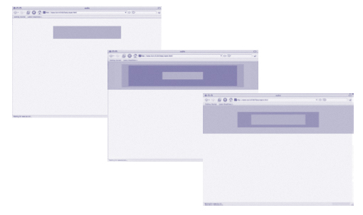
Peter Bilak: Het Natuurloket Identity (2001)
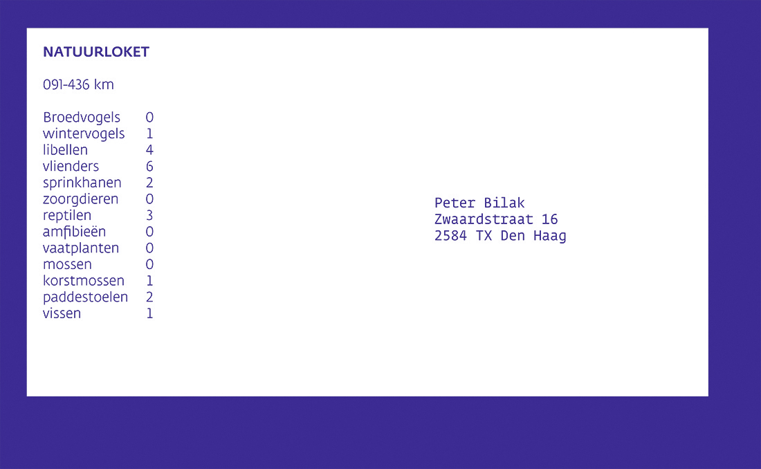
Het Natuurloket Envelope
Jon Sueda: Do you consider your work to be speculative?
Peter Bilak: I suppose most creative work is by its very definition speculative. It is formed on a basis of incomplete information, involves intuition, and explores new areas, which means it also runs the risk of not always delivering what it promises. So yes, I do think I engage in the creative process with slightly unpre- dictable results.
JS: What is Het Natuurloket, and what was the impetus for this project?
PB: It seems very long time ago, so my recollection of the process is rather blurry. Taco Zwaanswijk, a colleague that I shared a studio with, was asked by the Dutch Ministry of Agriculture to develop a website and identity for a new independent foundation that informs people about endangered species of animals and provides information from the large database of the ministry about flora and fauna.
We proposed to use this database for the identity. It would combine the existing database of agricultural species with an electronic address book. Every time a letter was sent out, an address was printed on the envelope, along with the information about what animals live in the recipient’s particular square kilometer. This information was extracted from the database using the recipient’s postal code. Visually, the identity looked very simple — just a black-and-white list of species.
JS: What led you to the idea for a database-driven identity? Was it based purely on the client’s brief, or had you already been thinking about the possibilities of using data to drive a visual identity?
PB: During the design process, it was clear that there was little room for illustrative approaches. The task was to see how to visualize and deliver a very large amount of information to someone who is not ready to spend much time studying the quantity of information. We didn’t want the information to become mere decoration, which was quite a trendy design approach at the time. Some designers illustrate complexity by revealing everything, overwhelming the user with facts, complex diagrams, and structures. So instead, we used a specific filter to show what was necessary. Instead of using a designer’s perspective and filtering what suited Taco and myself, we decided to focus on the user’s perspective and filter from the large database of information what was relevant to the user. This thinking was based on the project; I hadn’t been dealing with a database-driven identity before.
JS: Have you used a similar concept or technology on other projects since?
PB: Not really. I’ve worked on proposals for two complex identity projects since.
The Twin Cities Typeface (St. Paul & Minneapolis) and the identity of the Olympic candidate city, which used dynamically generated imagery. It is interesting to use technology that is not really meant to be used in print design.
JS: Did this project stimulate discussion or debate in your studio?
PB: Yes. But not more than any other project. We discuss all things we work on.
JS: You said in your last note that the client wasn’t impressed with the look of this identity. Why was this identity best executed in such a simple graphic language?
PB: The fact that the client didn’t really appreciate the process and the results are illustrated by the fact that the website hasn’t changed since then, and the identity was never implemented. What we proposed at the time seemed to make perfect sense, and that’s why we stood by it. If we were to work on it again today, of course it might be different, but since it is irrelevant now, I don’t really think of it much.
JS: What do you do with rejected proposals?
PB: Nothing really. There is plenty of work, so if ideas are rejected, they are sim- ply archived on a hard disk, along with all other work. I don’t dwell too much on past work, so I rarely keep hard copies. Sometimes, if I feel the work wasn’t strong enough, we might lose the back-ups, too.
JS: How do you define the realization of a design idea or concept?
PB: A design project is always a negotiation between two parties, so if a proposal is one-sided and not accepted by the other party, it is certainly a failure. The project itself is not always the problem; often, the way it’s explained to the client may not resonate with his or her ideas. If the client rejects a proposal, it often says more about my (in) ability to explain things in simple terms. Luckily, it doesn’t happen to me very often — it just proves the point that if I can learn to present things more efficiently by adopting both points of views in my work (client and designer), projects have a better chance of being understood and accepted. As a matter of fact, in talking about design I learned to avoid phrases starting with “I think,” “I believe,” etc. Instead, I focus on what the object does to people.
The last two rejected projects I proposed were refused partly because I wasn’t able to present the work in person, and the presentation panels were sent by email and post. This was a good lesson, and I don’t do projects anymore unless I can present them in person.
Having said all this, “failures” have big value to me personally, because they force me to reevaluate what I take for granted. This is what a successful realization can’t do.